The Psychology of Color in Food Snacks Packaging Bags: Unlocking Consumer Choices
Release Time:2024-11-07
The Psychology of Color in Food Snacks Packaging Bags
Table of Contents
1. Introduction: The Significance of Color in Packaging
2. Understanding Color Psychology in Marketing
3. The Impact of Color on Consumer Behavior
3.1. The Role of Color in Brand Recognition
3.2. Emotional Responses to Color
4. Popular Colors in Food Snacks Packaging
4.1. Red: The Color of Appetite
4.2. Green: Freshness and Health
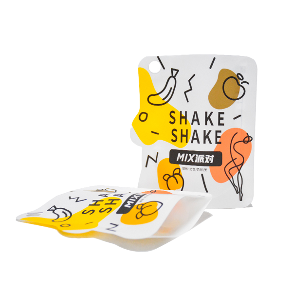
4.3. Yellow: Cheerfulness and Energy
4.4. Blue: Trust and Dependability
4.5. Orange: Playfulness and Enthusiasm
5. Designing Snack Packaging: Best Practices
5.1. Aligning Color with Brand Identity
5.2. Using Contrast for Visibility
5.3. Cultural Considerations in Color Use
6. Case Studies: Successful Brands and Their Color Choices
7. Conclusion: The Future of Color in Food Snacks Packaging
8. FAQs
1. Introduction: The Significance of Color in Packaging
In the competitive world of food snacks, packaging serves as the first point of contact between consumers and products. The significance of **color in packaging** cannot be overstated; it plays a pivotal role in attracting attention, conveying messages, and influencing purchasing decisions. By understanding the **psychology of color**, brands can harness this powerful tool to create packaging that not only stands out on shelves but also resonates with their target audience.

2. Understanding Color Psychology in Marketing
Color psychology is the study of how colors affect perceptions and behaviors. In marketing, colors can evoke emotions, signal quality, and even affect appetite. For snack foods, where impulse buys are common, leveraging color psychology can be particularly effective. Brands that utilize colors thoughtfully can create a connection with consumers, making their products more appealing.
3. The Impact of Color on Consumer Behavior
Color influences consumer behavior in several ways, from initial attraction to long-term brand loyalty.
3.1. The Role of Color in Brand Recognition
Colors help in establishing brand identity. For instance, brands like **Coca-Cola** utilize red to enhance recognition and create a sense of excitement. Studies indicate that color can increase brand recognition by up to **80%**, making it a crucial element in packaging design.
3.2. Emotional Responses to Color
Different colors evoke different emotional responses. For example, warm colors like red and orange can stimulate feelings of hunger and excitement, while cooler colors like blue and green can instill a sense of calm and trust. Understanding these emotional triggers is vital for creating packaging that resonates with consumers.
4. Popular Colors in Food Snacks Packaging
Different colors convey distinct messages and elicit varying emotional responses. Here, we explore some of the most popular colors used in food snacks packaging and their psychological implications.
4.1. Red: The Color of Appetite
Red is widely recognized as a color that stimulates appetite. It is often used in the packaging of food products because it grabs attention and creates a sense of urgency. Brands like **Lay's** use red prominently on their packaging to attract consumers and encourage impulse buying.
4.2. Green: Freshness and Health
Green is associated with health, freshness, and nature. Brands that prioritize organic or healthy snack options often use green in their packaging to communicate that their products are natural and nutritious. A prime example is **Nature Valley**, which uses green to emphasize its wholesome ingredients.
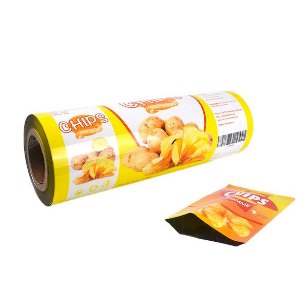
4.3. Yellow: Cheerfulness and Energy
Yellow is a bright, cheerful color that can evoke feelings of happiness and positivity. It is commonly used in snack food packaging aimed at children or fun products. **M&M's** effectively employs yellow to convey a sense of joy and playfulness.
4.4. Blue: Trust and Dependability
Blue is often associated with trust and reliability. Many brands use blue in their packaging to communicate quality and dependability. For instance, **Blue Diamond Almonds** utilizes blue to enhance its image as a trustworthy snack option.
4.5. Orange: Playfulness and Enthusiasm
Orange is a vibrant, energetic color that signifies playfulness and enthusiasm. It is frequently used in snacks aimed at a younger audience. Brands like **Cheez-It** leverage orange to create an engaging and lively product image.
5. Designing Snack Packaging: Best Practices
Creating effective snack packaging involves more than just selecting appealing colors. Here are some best practices to consider:
5.1. Aligning Color with Brand Identity
Consistency is key. Ensure that the colors used in your packaging align with your overall brand identity. This helps establish a cohesive image that consumers can easily recognize.
5.2. Using Contrast for Visibility
High-contrast color combinations can enhance visibility and make packaging stand out on shelves. Consider pairing bold colors with softer hues to create eye-catching designs that attract consumers’ attention.
5.3. Cultural Considerations in Color Use
Different cultures have varying associations with colors. When designing packaging for a global market, it’s essential to research cultural connotations to avoid any potential misinterpretations or negative associations.
6. Case Studies: Successful Brands and Their Color Choices
To illustrate the impact of color psychology in packaging, let’s examine a few successful brands and their strategic use of color:
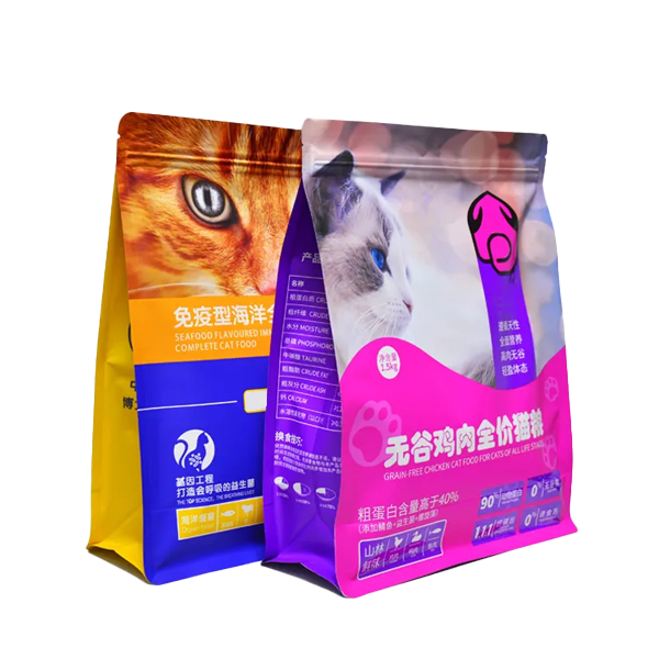
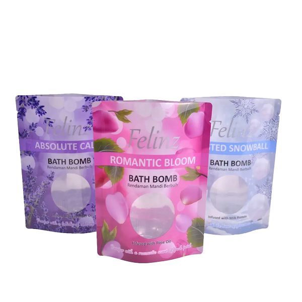
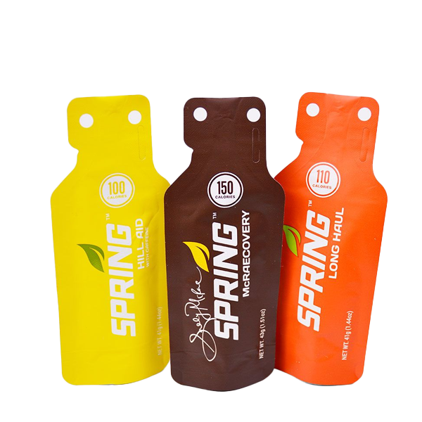
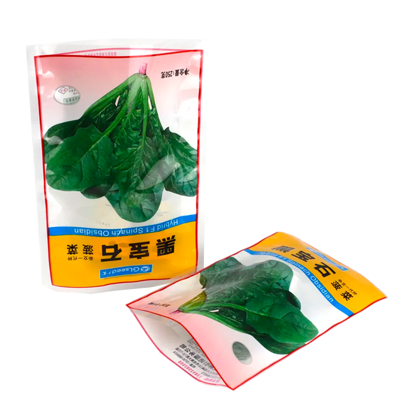
- **Pringles:** The iconic red and white packaging instantly captures attention and conveys a sense of fun. The brand's use of red complements its playful image, attracting both adults and children alike.
- **Oreo:** The classic black and white packaging of Oreo cookies conveys a sense of indulgence and quality. The contrast not only enhances brand recognition but also appeals to consumers’ desire for a premium snack option.
- **KIND Bars:** The earthy tones and green accents in KIND Bars’ packaging emphasize health and natural ingredients. This strategic use of color resonates with health-conscious consumers looking for nutritious snack options.
7. Conclusion: The Future of Color in Food Snacks Packaging
As consumer preferences evolve, so too will the strategies behind food snacks packaging. Brands must stay ahead of trends and adapt their color choices to align with changing consumer perceptions and behaviors. By understanding the psychology of color and its impact on purchasing decisions, businesses can create packaging that not only attracts attention but also fosters brand loyalty and enhances overall consumer experience.
8. FAQs
What is color psychology in marketing?
Color psychology is the study of how colors influence perceptions, emotions, and behaviors in consumers, particularly in marketing and branding.
How does color affect food choices?
Colors can evoke specific emotions and associations that influence consumer preferences, appetite stimulation, and purchasing decisions.
Why is packaging color important for snacks?
Packaging color helps establish brand identity, attracts consumer attention, and can communicate important information about the product.
What are some common colors used in food packaging, and what do they represent?
Common colors include red (appetite stimulation), green (freshness and health), yellow (cheerfulness), blue (trust), and orange (playfulness).
How can brands ensure effective color use in their packaging designs?
Brands can align their color choices with their identity, utilize contrast for visibility, and consider cultural meanings associated with colors in their target markets.
Keywords:best Food Snacks Packaging Bag
Related News

One stop packaging customization service

You can email us
Coco Ma, Email: coco@zhongbao-group.com
Carrie Chan, Email: sales7@zhongbao-group.com
Office
Add: Room 1501, Building D, Suijin Center, No. 57, Jinshi 4th Road, Dayuan Street, Baiyun District, Guangzhou, Guangdong Province, China
Factory
Add: 2F, Building B, Ye Yi 'an Plant, Pingtang Industrial Park, Guanyao Dalan, Shishan Town, Nanhai District, Foshan City, China